HTML & CSS
HTML & CSS, Scrimba (6h) https://scrimba.com/learn/htmlandcss
HTML
id, class
The id of an element must be unique for the whole document.
An element can have multiple classes, they are separated by a space.
<p class="class1 class2"></p>
HTML Elements
The input element
The <input> tag has a password type for sensitive data.
<input type="password">
types with pickers: date, time, color Also, type="date" and type="time" display a button to select the date or time.
placeholder can be used to show an hint in the field.
<input type="text" placeholder="Enter username">
div and span elements
div and span can be used to apply CSS to content. div is block based, span is flex based.
lists
The item marker of a list can be set with list-style-image, BUT, the image cannot be aligned vertically which doesn't look good.
template
The template tag can be used to define snippets of html to be reused.
https://developer.mozilla.org/en-US/docs/Web/API/Web_components/Using_templates_and_slots
CSS
Defining a style sheet
<link rel=stylesheet href="style.css">
selectors
CSS works with selectors that define which elements are affected.
body {
  color: red;
  font-size: 20px;
}
Use divs to structure the page content and apply styling to them instead of directly to the elements, this is more future proof if the content changes in the future.
targeting in css
Elements are targeted by writing their name, classes are selected with a dot (.class), ids with a # (#id).
/* targetting the main class*/
.main {
   margin-top: 20px;
}
pseudo-classes
Elements can be targeted in specific conditions, for example the code below changes the text color when the cursor is over a link.
a:hover {
    color: black;
}
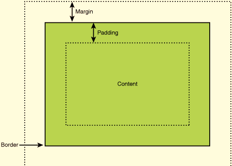
margins, padding and borders; the Box Model
Margins define space around an element, padding define space inside an element. Margins do not add up, for example if two elements next to each other have a margin of 20px and 15px, the renderer margin will be the highest, 20px in this case.
In CSS, margins, padding and borders are part of a concept called the Box Model.

Source: https://elementor.com/blog/margin-vs-padding
shorthand notation
/* all sides equal */
margin: 10px
/* top right bottom left */
margin: 10px 20px 5px 8px
/* top/bottom left/right */
margin: 10px 20px
display: inline, block, flex (Flexbox)
inline puts the elements on the same line as others if there is enough space. with block the element takes all the horizontal space and other elements are pushed below.
flex is used for Flexbox. Flexbox is described my MDN as "a one-dimensional layout method for arranging items in rows or columns". Flex only changes the layout of direct child elements but not their content.
.section {
    display: flex;
    justify-content: center;
    align-items: center;
    /* the default orientation of flexbox is row */
    flex-direction: column;
}
Centering elements
An element can be centered using margins this way:
- Make it
display: block - Define a width
- Have
margin-leftandmargin-rightset toauto.
Some elements can also be centered using text-align: center, this property does not only apply to text.
borders
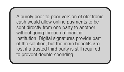
Borders are defined with border. Borders can be rounded using border-radius.

border: 4px solid #222222;
border-radius: 20px;
text shadow
/*  negative values for left and top  */
/* left-right top-down color */
text-shadow: 5px 5px black;
/* left-right top-down blur color */
text-shadow: 5px 5px 5px black;
Text can be highlighted using a blur only shadow. This is useful to make text more readable when the text color blends too much with the background.
text-shadow: 0px 0px 4px black;
trick: make gradient color text
background-image: linear-gradient(to right,red,orange,black);
background-clip: text;
-webkit-text-fill-color: transparent;
Design fundamentals
Understanding Design Fundamentals, Scrimba (45mins) https://scrimba.com/learn/design
- Use whitespace
- Align elements
- Contrast
- Typography
- Color
Whitespace
Use whitespace (also called negative space) to make content less crammed more aestically pleasing. Increasing the line height makes the text easier to read.
p {
    line-height: 1.5em;
}
Contrast
The WCAG contrast guidlelines recommends a contrast ratio of 3:1 for large text and 4.5:1 for text and images.
Typography
- Use no more than 1 or 2 fonts.
- Establish the importance of elements with visual hierarchy.
Color
- Don't use too many colors.
- Use colors that contrast well together.
- Use slight variations of the same color.
https://coolors.co is useful to generate color palettes.